
Table of Contents
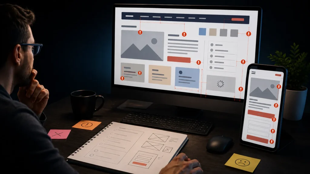
Website design mistakes often look harmless during a project, yet they can create serious barriers between a visitor and the next step. A confusing headline, weak mobile layout, slow page, or unclear form can make a credible business appear difficult to trust. The result may be fewer inquiries, bookings, purchases, or other meaningful actions.
The most damaging website design mistakes are not always dramatic visual failures. Many are small decisions that increase cognitive effort: too many choices, inconsistent buttons, unreadable text, unnecessary fields, and pages that do not match visitor expectations. These issues can reduce confidence even when the service or product itself is strong.
This guide examines website mistakes that reduce conversions and explains how to correct them without relying on trends or unsupported promises. Conversion improvement starts with clarity, relevance, usability, accessibility, and reliable performance. The first eight mistakes below focus on foundations every business website should review before investing in more traffic.
Website Design Mistakes That Weaken Clarity and Trust
1. An Unclear Value Proposition Above the Fold
Visitors should quickly understand what the business offers, who the offer is for, and why it matters. A hero section that uses vague claims such as “innovative solutions” or “we create success” forces users to interpret the message. This is one of the most common website design mistakes because the page may look polished while failing to communicate its purpose.
A stronger hero uses a specific headline, a short supporting explanation, and a relevant next step. It does not need to explain the entire business, but it should create accurate expectations. If the company provides several services, the headline should establish the central category before introducing individual options.
Review the page with someone unfamiliar with the business. Show it briefly, then ask what the company does and which action appears most important. Confused answers indicate that the value proposition or visual hierarchy needs revision.
2. A Cluttered Visual Hierarchy
When every heading, button, image, statistic, and card demands equal attention, visitors cannot identify what matters first. Clutter also comes from excessive colors, inconsistent spacing, competing font sizes, decorative animation, and repeated calls to action.
Effective hierarchy creates an intentional reading order. The primary heading should lead into supporting information, proof, and a clear action. A professional website design service should establish reusable rules for spacing, typography, buttons, and content sections rather than styling each block independently.
Avoiding website design mistakes does not require removing every decorative element. Reduce only what distracts from the page goal. Empty space is valuable when it improves grouping and comprehension rather than serving minimalism for its own sake.
3. Low Contrast and Difficult-to-Read Typography
Thin fonts, small text, long line lengths, and weak contrast can make a page uncomfortable to read. These website design mistakes become more damaging on mobile devices, textured backgrounds, bright screens, or text placed over photographs.
The W3C guidance on minimum text contrast explains why sufficient separation between text and its background supports readability. Designers should also test body text size, line height, link visibility, and zoom behavior instead of judging typography only on a large monitor.
Decorative fonts can be used selectively, but body copy, form labels, navigation, and buttons need clarity. Avoid placing essential information inside images because it may not resize properly and can create accessibility problems.

Website Design Mistakes That Create Conversion Friction
4. Confusing or Overcomplicated Navigation
Navigation should help visitors predict where each link will lead. Creative labels may appear distinctive, but terms such as “Discover,” “Solutions,” or “Experience” can become ambiguous without context. Deep dropdown menus, duplicated links, and too many top-level choices create additional friction.
A service website usually benefits from familiar labels such as Services, Projects, About, Blog, and Contact. The exact structure should reflect the content, but users should not have to learn a new vocabulary. Reviewing relevant website design projects can show how navigation changes according to business type without becoming unpredictable.
Mobile navigation requires separate attention. Links should be easy to tap, the menu should open and close reliably, and important actions should not disappear behind unclear icons. Test navigation with keyboard input as well as touch and mouse controls.
5. Weak, Competing, or Misleading Calls to Action
A page may contain attractive buttons and still lack a clear conversion path. One section says “Learn More,” another says “Get Started,” and a third says “Contact Us,” even though all three lead to the same form. This inconsistency makes users question what will happen after each click.
Strong calls to action are specific and proportionate to the visitor’s level of commitment. “Book a Consultation” is clearer than “Start Now” when the next step is a consultation. Supporting actions can remain available, but they should not visually overpower the primary action.
Avoid false urgency, hidden conditions, or buttons that promise one result and lead somewhere unrelated. Many website mistakes that reduce conversions involve expectation gaps rather than missing buttons. The text, visual emphasis, destination, and actual process must agree.
6. Forms That Ask for Too Much Too Soon
Every form field creates work and may raise privacy or commitment concerns. A first-contact form rarely needs every detail required for a full proposal. Asking for unnecessary information before trust has been established can cause users to abandon the page.
Start with the information genuinely needed to respond. Name, contact method, service interest, and a short project message may be sufficient for an initial inquiry, depending on the business. More complex qualification can happen later when operationally necessary.
Forms also need visible labels, helpful error messages, clear required-field indicators, and confirmation after submission. Test invalid entries, keyboard navigation, mobile input, and slow connections. A form that provides no feedback is one of the most costly website design mistakes because the business may lose leads without realizing it.
Website Design Mistakes That Hurt Mobile Performance
7. Treating Mobile Design as a Smaller Desktop Version
Responsive design involves more than stacking desktop columns. On a phone, oversized headings may occupy the entire first screen, buttons may sit too close together, images may crop important content, and long menus may become difficult to use.
Google recommends responsive web design for mobile websites because it is practical to implement and maintain. However, technical responsiveness does not automatically create a good mobile experience. Content priority, touch targets, spacing, form inputs, and loading behavior still require manual review.
Test the complete journey on real phones, not only in a browser preview. Open the menu, read service details, submit forms, use phone and email links, and check whether sticky elements cover content. A mobile visitor should receive the same essential information and functionality without unnecessary obstacles.
8. Ignoring Page Speed and Visual Stability
Large uncompressed images, excessive scripts, heavy animation, too many fonts, and unnecessary plugins can slow a page. These website design mistakes become conversion problems when visitors wait for content, tap an unresponsive control, or click the wrong element because the layout shifts.
The official Core Web Vitals guidance focuses on loading performance, interaction responsiveness, and visual stability. These metrics do not describe every part of user experience, but they provide a useful technical framework for identifying frustrating behavior.
Performance should be considered during design, development, and content publishing. Choose suitable image dimensions and formats, limit features without clear value, and retest after adding plugins or media. The project approach and working process should also clarify who is responsible for performance before and after launch.
Image Suggestion
- Search Query: responsive website speed testing on laptop and smartphone
- Recommended Source: Pixabay
- License Type: Pixabay Content License, free for commercial use subject to license terms
- SEO ALT Text: Testing mobile performance to prevent website design mistakes that reduce conversions
These first website design mistakes share one pattern: they make visitors work harder than necessary. Clear messaging, readable content, predictable navigation, focused actions, usable forms, responsive layouts, and stable performance create a stronger conversion foundation.
Complete the List: Two Website Design Mistakes That Damage Trust and Measurement
The earlier sections covered clarity, hierarchy, navigation, calls to action, forms, mobile usability, and performance. Two additional website design mistakes often remain hidden until a business starts reviewing lead quality or customer feedback. The first weakens credibility, while the second prevents the team from understanding what is working.
9. Using Weak, Missing, or Unverified Trust Signals
Visitors look for evidence before they contact an unfamiliar business. Relevant project examples, accurate service details, genuine testimonials, clear contact information, policies, and a professional About page can reduce uncertainty. Trust is weakened when a website uses placeholder projects, repeated reviews, unsupported statistics, or stock imagery presented as a real team member.
Trust signals should be specific and truthful. A case study is useful when it explains the challenge, work completed, and outcome without exaggeration. When proof is limited, describe the process clearly rather than inventing achievements.
These website mistakes that reduce conversions can be especially damaging for service businesses because the visitor is evaluating both competence and reliability. Before publishing, verify every number, client quote, certification, logo, project description, and personal image. Anything that cannot be confirmed should be removed or rewritten.
10. Launching Without Conversion Tracking or Regular Review
A website may look complete while providing no reliable way to evaluate inquiries, bookings, phone calls, or form submissions. Without measurement, businesses may spend money attracting visitors but remain unable to identify which pages, campaigns, or calls to action contribute to valuable outcomes.
Conversion tracking should focus on meaningful actions, not vanity metrics alone. Test every form, thank-you message, phone link, and booking path before launch, then review the data for errors.
This is one of the most expensive website design mistakes because it delays learning. The website should also be reviewed after content updates, plugin changes, campaign launches, and major traffic increases. Measurement is not a one-time installation; it requires validation and responsible interpretation.
What are the most common website design mistakes?
The most common website design mistakes include unclear headlines, cluttered layouts, confusing navigation, weak calls to action, difficult forms, poor mobile responsiveness, slow loading, low text contrast, inconsistent styling, and missing trust signals. These issues make it harder for visitors to understand the offer, find information, and complete meaningful actions such as contacting the business or requesting a consultation.
How do website design mistakes reduce conversions?
Many website mistakes that reduce conversions increase friction in the customer journey. Visitors may leave when a page loads slowly, the message is unclear, buttons are difficult to find, or a form requests too much information. Conversion problems often result from several small usability issues rather than one major failure. Improving clarity, speed, accessibility, and trust can remove unnecessary barriers.
How can I tell whether my website design is hurting conversions?
Review the website from the perspective of a first-time visitor. Check whether the business offer is immediately clear, the primary action is obvious, and important pages are easy to find. Examine form completion, mobile usability, page speed, broken links, and visitor behavior. High traffic with very few inquiries may indicate problems, although the offer, audience quality, and marketing strategy should also be evaluated.
Can a visually attractive website still have conversion problems?
Yes. A website can look modern while still containing serious website design mistakes. Oversized headings, excessive animation, low-contrast text, unclear navigation, or confusing page structures may create a stylish appearance but weaken usability. Visual quality should support communication and decision-making. Design elements that distract visitors from the offer or next step should be simplified or removed.
Why are unclear calls to action a common website mistake?
An unclear call to action does not tell visitors what will happen after they click. Generic labels such as “Learn More” or “Get Started” may be unsuitable when the real action is booking a consultation or submitting a project request. Competing buttons can also create uncertainty. Calls to action should use specific wording, consistent styling, and destinations that match the visitor’s expectations.
How many fields should a website contact form include?
A contact form should request only the information required for the next step. For an initial inquiry, a name, contact method, service interest, and short message may be enough. Longer forms may be appropriate when qualification is necessary, but unnecessary fields can increase abandonment. Every form should also include visible labels, clear error messages, mobile-friendly inputs, and submission confirmation.
How important is mobile design for website conversions?
Mobile design is essential because users may discover, evaluate, and contact a business entirely from a smartphone. Common mobile website design mistakes include tiny text, crowded buttons, oversized images, hidden content, difficult menus, and forms that are hard to complete. Mobile testing should cover the complete user journey on real devices rather than only checking whether the layout technically resizes.
How often should a business review its website for design problems?
A business should review its website regularly and after major content, plugin, or design changes. Check forms, links, navigation, mobile layouts, performance, accessibility, and conversion tracking. A complete redesign is not always necessary. Many website mistakes that reduce conversions can be corrected through focused improvements to messaging, hierarchy, speed, forms, and calls to action.
Targeted Optimization vs a Full Website Redesign
Finding several website design mistakes does not automatically mean the entire site must be rebuilt. The correct response depends on whether the underlying structure, technology, content system, and customer journey still support the business.
When Targeted Improvements Are Enough
Focused optimization may be appropriate when the website is technically stable and the main problems involve headlines, spacing, calls to action, form fields, mobile adjustments, image sizes, or individual landing pages. These changes can often be prioritized and tested without disrupting the whole site.
Targeted work is easier to evaluate when each change has a defined purpose. Document the original problem, proposed change, success measure, and review period.
When a Full Redesign Is More Responsible
A redesign may be justified when navigation no longer reflects the services, the platform is difficult to maintain, mobile problems affect most pages, the visual identity is inconsistent, or essential functionality depends on outdated tools. Rebuilding may also be more efficient when fixing one area repeatedly creates problems elsewhere.
Do not approve a redesign only because the site looks old. A new style will not solve unclear positioning, weak content, or poor measurement. The project scope should clarify whether the website needs focused optimization, structural changes, or a complete rebuild.

Best Practices for Fixing Website Design Mistakes
Audit the Complete Customer Journey
Review the website as a sequence rather than a collection of isolated pages. Start with the source that brings a visitor to the site, then follow the path through the landing page, service information, proof, form, confirmation, and follow-up. A page can appear effective alone while creating friction within the complete journey.
Test common tasks on desktop and mobile. Ask someone unfamiliar with the business to locate a service, understand the offer, and submit an inquiry. Observe where they hesitate instead of explaining the interface.
Prioritize Problems by Impact and Effort
Not all website design mistakes deserve equal priority. A broken form or unreadable mobile menu should be corrected before minor visual inconsistencies. Create a list of issues and assess each one according to business impact, user impact, risk, effort, and dependency on other work.
Begin with critical failures, then address high-impact improvements that can be completed responsibly. Avoid changing many unrelated elements at once when measurement matters. Smaller, documented updates make it easier to understand whether the customer experience has improved.
Use Tools Without Replacing Human Testing
Google’s PageSpeed Insights can report performance information for mobile and desktop and suggest areas for investigation. Automated accessibility and SEO tools can also identify certain technical issues. However, tools cannot fully judge whether an offer is clear, a testimonial is credible, or a customer journey makes sense.
Human review should include keyboard navigation, zoom, real-device testing, form errors, content accuracy, and the clarity of each next step.

How Much Does It Cost to Fix Website Design Mistakes?
There is no universal price for correcting website design mistakes. Cost depends on the number of affected pages, the platform, code quality, content requirements, accessibility work, integrations, form complexity, tracking setup, and whether the existing design system can be reused.
Targeted Fixes
Smaller projects may focus on navigation, calls to action, responsive spacing, typography, image optimization, or one conversion form. The quote should identify the exact pages, deliverables, testing process, revision limits, and any exclusions. A low price is not useful when it omits mobile testing or leaves the underlying problem unresolved.
Conversion-Focused Optimization
A broader optimization project may include journey mapping, content revision, analytics review, landing-page improvements, form testing, accessibility checks, and performance work. Website mistakes that reduce conversions often involve several connected parts of the experience.
Full Redesign Costs
A full redesign typically includes strategy, sitemap planning, content responsibilities, visual design, development, migration, testing, training, and launch support. Recurring costs may include hosting, maintenance, premium licenses, security, backups, and ongoing improvements. Request a detailed scope instead of comparing only the final price.

Final Checklist and Conclusion
- Confirm that the main offer is clear within the opening section.
- Use a consistent hierarchy for headings, text, buttons, and spacing.
- Keep navigation familiar, predictable, and usable by keyboard.
- Match every call to action with the correct destination.
- Remove unnecessary form fields and test validation messages.
- Check contrast, typography, labels, and alternative text.
- Test the complete journey on real mobile devices.
- Optimize images, scripts, fonts, and visual stability.
- Publish only accurate projects, reviews, statistics, and credentials.
- Validate conversion tracking and review the site regularly.
The most important website design mistakes are the ones that make a visitor uncertain, slow down a task, or hide the next step. Correcting them requires more than making the site look modern. The work should improve clarity, usability, accessibility, trust, performance, and measurement together.
Businesses should address website mistakes that reduce conversions according to evidence and business priority. Some websites need only focused improvements, while others require deeper restructuring. The right solution is the smallest responsible change that solves the real problem and remains maintainable.
For a professional review of your website structure and conversion path, explore the available digital services or use the contact page to discuss your project. A clear assessment can identify which issues require immediate correction and which improvements can be planned for a later phase.